
How often do we find ourselves accepting ambiguous conditions online, or following unclear flows where we realise we are not in control of the experience?
The technical term for these situations is dark patterns, meaning:
all those techniques that distort people’s choices, leading them to take a particular action online while reducing the user’s awareness.
The classic example is the cookie acceptance popup, where the experience is designed to focus the user on accepting them all.
The classic technique is action asymmetry: the desired direction is easy to follow, while the opposite direction is a little less so.
When accepting cookies, it is much easier to accept them all than to go into the options and untick the boxes (things have changed since 10 January, with the data protection authority’s guidelines).
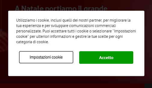 How can you refuse cookies in this popup?
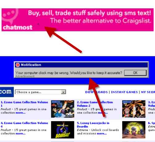
Online advertising also sometimes uses little tricks to get a banner click.
The image below shows two examples. In the first banner, a fake little smudge has been added, which will lead the user to click while trying to clean their smartphone screen.
The second example is a classic banner from the early 2000s, which recreated a Windows alert message to obtain an unwitting click.
Another dark-pattern technique is ‘hidden costs’.
The user goes through the entire purchase flow and only at the end discovers costs that were not disclosed in advance (activation fees, shipping costs, etc.).
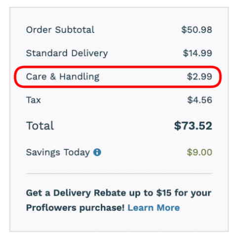
The ‘darkest’ case is when the user is not even aware of these hidden costs because they are not clearly displayed (and, alas, we only discover them later on the bill).
Along the same lines are charges for preselected options that the user does not notice.
A lack of clarity and transparency is probably the most dangerous dark pattern.
Conversely, in ecommerce the best customer experience comes from showing from the outset what they will have to pay and what the offer includes, with a contextual shopping basket that updates according to the items purchased.
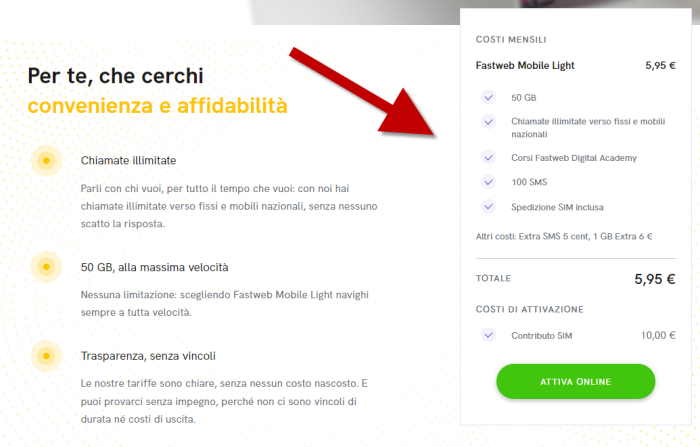 Example of a contextual shopping basket clearly showing the costs of the offer
These techniques exploit the information society’s problem: attention.
People are increasingly distracted, so it takes very little to make them see only what you want.
It should be said that sometimes, when designing UX there are dark patterns that are unintended or inherent in the process itself.
As users, to avoid dark paths online (and offline), let’s always keep the light of attention switched on 🔦!
For those designing the online user experience, the solution is always to carry out usability tests.